


by Horacio Ochoa, on Nov 24, 2020 11:11:08 AM
Did you notice something new in your Bloomz app this morning? That's right! A new look and feel came out today that resembles the style we already have in our mobile apps.
Here's what's new:
Better use of space
The old app design left too much unused space in your computer screen. The new app now makes better use of it by expanding to every corner, allowing more room for all the amazing features your app can do.
Cleaner design
While we maintain the color palette of our brand, the new app feels cleaner than ever. Lighter colors make for better reading and highlighting the important things.
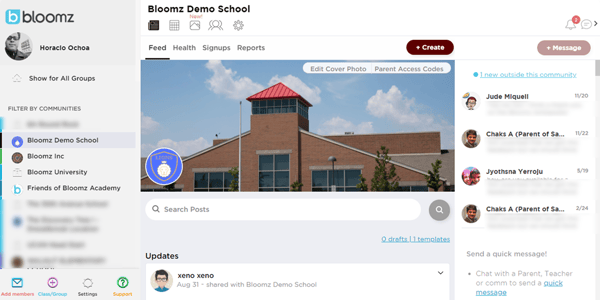
Images really make an impact
With the better use of space, pictures and videos in your feed really leave an impression. The use of the full width of your feed to display pictures helps bring eyes to your pictures in a great way!
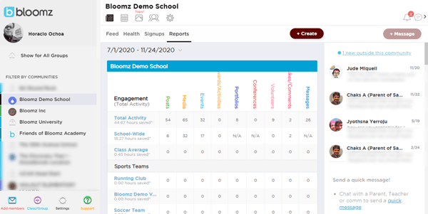
Space and more space!
We're really loving the better use of space in our new look. But even when you think you can't get more, you can! Want to show your behavior tracker with students? Try hiding the conversation panel on the right of your screen (just click on the messaging icon on top) and see how much better your screen looks projected in the wall.
If you're school is on Bloomz, the activity report looks so much better with the conversation panel hidden too.
Let us know what you think about the new look of your Bloomz app, we can't wait to read your comments below.